Tpot Optimized Classification
Analysis of the Bottle Rocket pattern in the stock market
This is our third-generation model. The models for the first-generation analysis were summarized on October 17, 2017. The second-generation model was done on August 3, 2018, and the third-generation model was completed on December 12, 2019.
We have achieved a major improvement in the results by using TPOT on a dataset that was computed by the HedgeTools Watch program.
Please see the Summary below
Charles R. Brauer (CBrauer@CypressPoint.com).
import itertools
import sys

import collections as count
import joblib
import matplotlib
import numpy as np
import pandas as pd
import platform
import seaborn as sns
import sklearn
import tpot
import warnings
from IPython.core.display import HTML, display
from copy import copy
from datetime import date
from matplotlib import gridspec, pyplot as plt
from scipy import stats
from sklearn.decomposition import PCA
from sklearn.ensemble import ExtraTreesClassifier
from sklearn.kernel_approximation import Nystroem
from sklearn.metrics import (
    accuracy_score,
    auc,
    average_precision_score,
    classification_report,
    cohen_kappa_score,
    confusion_matrix,
    f1_score,
    log_loss,
    mean_squared_error,
    precision_score,
    r2_score,
    recall_score,
    roc_auc_score,
    roc_curve,
)
from sklearn.model_selection import cross_val_predict, train_test_split
from sklearn.pipeline import make_pipeline, make_union
from sklearn.preprocessing import FunctionTransformer, StandardScaler
from sklearn.utils import shuffle

warnings.simplefilter('ignore')

%matplotlib inline
Our computing environment for this analysis is:
print('date........................', date.today())
print('Operating system version....', platform.platform())
print("Python version is........... %s.%s.%s" % sys.version_info[:3])
print('scikit-learn version is.....', sklearn.__version__)
print('pandas version is...........', pd.__version__)
print('numpy version is............', np.__version__)
print('matplotlib version is.......', matplotlib.__version__)
print('tpot version is.............', tpot.__version__)
date........................ 2019-12-09
Operating system version.... Windows-10-10.0.18362-SP0
Python version is........... 3.7.3
scikit-learn version is..... 0.21.3
pandas version is........... 0.25.2
numpy version is............ 1.17.4
matplotlib version is....... 3.1.2
tpot version is............. 0.10.2
Here we load the Bottle Rocket dataset, and create training and verifying datasets
try:
    model_smote = pd.read_csv('H:/HedgeTools/Datasets/rocket-train-classify-smote.csv')
except FileNotFoundError:
    print('file not found')

response_name = ['Altitude']
feature_names = ['BoxRatio', 'Thrust', 'Acceleration', 'Velocity', 'OnBalRun', 'vwapGain']
headers = feature_names + response_name

# model_smote = model_full[headers]
model_smote = shuffle(model_smote)
pd.set_option('display.expand_frame_repr', False)
print('Model dataset:\n', model_smote.head(5))
print('\nDescription of model dataset:\n', model_smote[feature_names].describe(include='all'))

X = model_smote[feature_names].values
y = model_smote[response_name].values.ravel()

X_train, X_verify, y_train, y_verify = train_test_split(X,
                                                        y,
                                                        test_size=0.2,
                                                        random_state=7)

print('\nSize of Dataset:')
print(' train shape..... ', X_train.shape, y_train.shape)
print(' verify shape.... ', X_verify.shape, y_verify.shape)
Model dataset:
        BoxRatio    Thrust  Acceleration  Velocity  OnBalRun  vwapGain  Altitude
11548 -1.135900 -1.136300      0.561800  0.282900  0.880900  0.665200         0
11412 -0.043000 -0.811900      2.210600  4.931400  1.835500  0.591700         0
341    3.266648  2.183157      0.640601  0.386844  0.342808 -0.322885         1
10447  0.979595  0.938154      0.877554  0.661304  1.423420  0.219403         1
8677  -0.790735 -0.958009      1.072000  1.152965  0.612775  0.944515         1

Description of model dataset:
            BoxRatio        Thrust  Acceleration      Velocity      OnBalRun      vwapGain
count  16076.000000  16076.000000  16076.000000  16076.000000  16076.000000  16076.000000
mean       0.085903     -0.343584      1.203227      1.833975      0.764012     -0.078409
std        1.215875      1.412710      0.611101      2.215105      0.483985      0.593752
min       -6.035697     -8.008904      0.043700     -0.349600     -0.140400     -0.936200
25%       -0.675234     -1.183127      0.786975      0.632975      0.385063     -0.531000
50%       -0.029615     -0.309042      1.108350      1.226250      0.705100     -0.205950
75%        0.781450      0.619500      1.495982      2.254440      1.113200      0.233167
max        5.239800      3.783000      6.389500     36.970100      2.804900      3.003900

Size of Dataset:
 train shape.....  (12860, 6) (12860,)
 verify shape....  (3216, 6) (3216,)
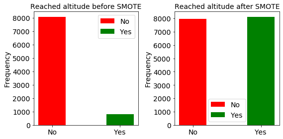
Here we show the distribution of the data before and after SMOTE upsampling.
try:
    model = pd.read_csv('H:/HedgeTools/Datasets/rocket-train-classify.csv')
except FileNotFoundError:
    print('model not found')

count = pd.value_counts(model['Altitude'], sort=True)
ratio = np.int(count[0]/count[1])
print('The training dataset is out-of-balance by a factor of ', ratio)
print('goal failed: ', count[0], ' goal met: ', count[1])

resample = ratio > 2
if resample:
    fig, (left, right) = plt.subplots(nrows=1, ncols=2, figsize=(8, 4))

    datas = [{'label': 'No',  'color': 'r', 'height': count[0]},
             {'label': 'Yes', 'color': 'g', 'height': count[1]}]
    # plot 1 ____________________________________________________________________
    plt.subplot(1, 2, 1)
    i = 0
    for data in datas:
        plt.bar(i, data['height'], align='center',
                color=data['color'], width=0.4)
        i += 1

    labels = [data['label'] for data in datas]
    pos = [i for i in range(len(datas))]
    font_size = 14
    plt.xticks(pos, labels, size=font_size)
    plt.yticks(size=font_size)
    plt.ylabel('Frequency', size=font_size)
    plt.title('Reached altitude before SMOTE', size=font_size)
    plt.rc('legend', **{'fontsize': font_size})
    plt.legend(labels)
    plt.tight_layout()
    # plot 2 ____________________________________________________________________
    plt.subplot(1, 2, 2)
    count = pd.value_counts(model_smote['Altitude'], sort=True)

    datas = [{'label': 'No',  'color': 'r', 'height': count[0]},
             {'label': 'Yes', 'color': 'g', 'height': count[1]}]
    i = 0
    for data in datas:
        plt.bar(i, data['height'], align='center',
                color=data['color'], width=0.4)
        i += 1

    labels = [data['label'] for data in datas]
    pos = [i for i in range(len(datas))]
    font_size = 14
    plt.xticks(pos, labels, size=font_size)
    plt.yticks(size=font_size)
    plt.ylabel('Frequency', size=font_size)
    plt.title('Reached altitude after SMOTE', size=font_size)
    plt.rc('legend', **{'fontsize': font_size})
    plt.legend(labels)
    plt.tight_layout()
    plt.show()
else:
    count = pd.value_counts(model_smote['Altitude'], sort=True)
    datas = [{'label': 'No',  'color': 'r', 'height': count[0]},
             {'label': 'Yes', 'color': 'g', 'height': count[1]}]
    i = 0
    for data in datas:
        plt.bar(i, data['height'], align='center',
                color=data['color'], width=0.4)
        i += 1

    labels = [data['label'] for data in datas]
    pos = [i for i in range(len(datas))]
    font_size = 14
    plt.xticks(pos, labels, size=font_size)
    plt.yticks(size=font_size)
    plt.ylabel('Frequency', size=font_size)
    plt.title('Reached altitude', size=font_size)
    plt.rc('legend', **{'fontsize': font_size})
    plt.legend(labels)
    plt.tight_layout()
    plt.show()
The training dataset is out-of-balance by a factor of  9
goal failed:  8051  goal met:  813
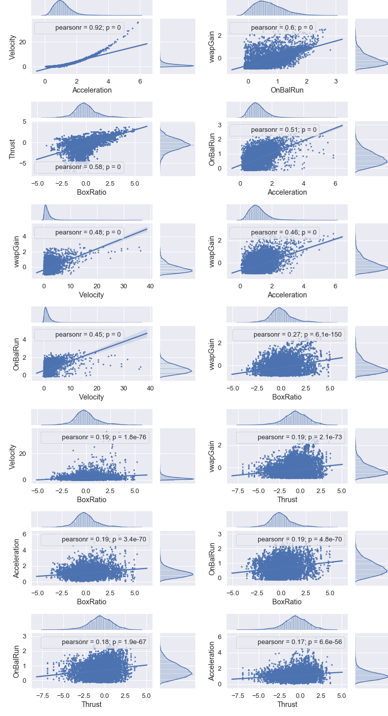
Identify Highly Correlated Features
Thanks to Chris Albon (https://chrisalbon.com/machine_learning/feature_selection/drop_highly_correlated_features/ for this code.
# Create correlation matrix
corr_matrix = model.corr().abs()

d = model.drop(['Altitude'], axis=1)
df = pd.DataFrame([[(i, j), d.corr().loc[i, j]]
                   for i, j in list(itertools.combinations(d.corr(), 2))],
                  columns=['pairs', 'corr'])
print(df.sort_values(by='corr', ascending=False))

# Select upper triangle of correlation matrix
upper = corr_matrix.where(np.triu(np.ones(corr_matrix.shape), k=1).astype(np.bool))

# Find index of feature columns with correlation greater than 0.95
to_drop = [column for column in upper.columns if any(upper[column] > 0.95)]
if not to_drop:
    print('Features to drop: None.')
else:
    print('Features to drop: ', to_drop)
                       pairs      corr
9   (Acceleration, Velocity)  0.920938
14      (OnBalRun, vwapGain)  0.597926
0         (BoxRatio, Thrust)  0.583623
10  (Acceleration, OnBalRun)  0.513526
13      (Velocity, vwapGain)  0.477387
11  (Acceleration, vwapGain)  0.464277
12      (Velocity, OnBalRun)  0.451862
4       (BoxRatio, vwapGain)  0.271821
2       (BoxRatio, Velocity)  0.194725
8         (Thrust, vwapGain)  0.190762
1   (BoxRatio, Acceleration)  0.186501
3       (BoxRatio, OnBalRun)  0.186295
7         (Thrust, OnBalRun)  0.182788
5     (Thrust, Acceleration)  0.166172
6         (Thrust, Velocity)  0.153853
Features to drop: None.
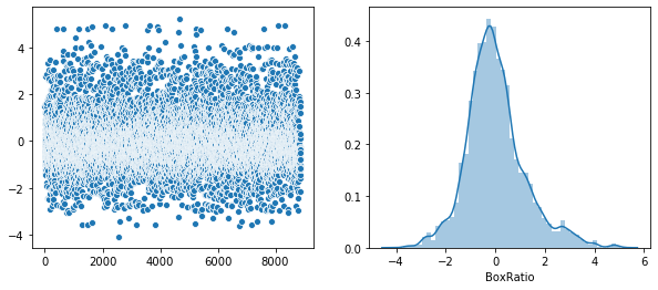
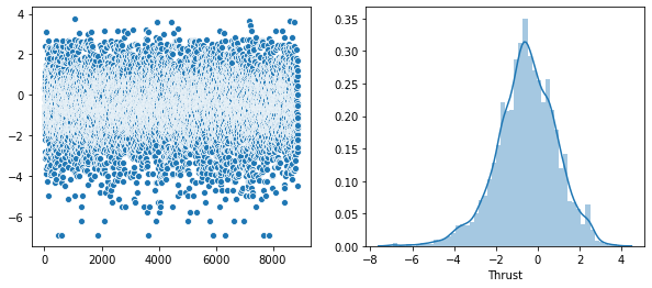
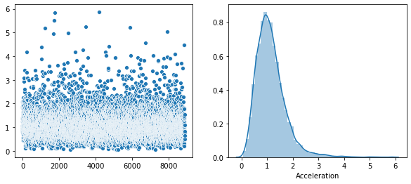
Plot of the distribution of each feature.
The above output shows that the highest correlation is 0.920938. Since this is below the 0.95 threshold, we will keep all the features.
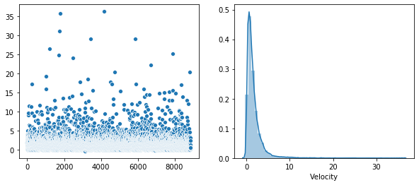
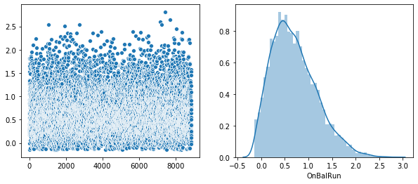
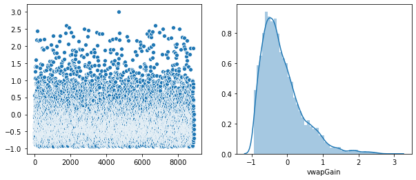
Rather that use a Seaborn “pairplot”, I wanted to show each distribution in greater detail. Below is a distribution plot of the six features in our dataset.
warnings.filterwarnings('ignore')
plt.figure(figsize=(10, 4))

df_br = model[['BoxRatio']]
v = df_br.BoxRatio.values
plt.subplot(1, 2, 1)
sns.scatterplot(data=v)
plt.subplot(1, 2, 2)
sns.distplot(v, axlabel='BoxRatio')
df1 = pd.DataFrame(data=v, columns=['BoxRatio'])
plt.show()

plt.figure(figsize=(10, 4))
df_th = model[['Thrust']]
v = df_th.Thrust.values
plt.subplot(1, 2, 1)
sns.scatterplot(data=v)
plt.subplot(1, 2, 2)
sns.distplot(v, axlabel='Thrust')
df2 = pd.DataFrame(data=v, columns=['Thrust'])
df3 = pd.concat([df1, df2], axis=1).reindex(df1.index)
plt.show()

plt.figure(figsize=(10, 4))
df_ac = model[['Acceleration']]
v = df_ac.Acceleration.values
plt.subplot(1, 2, 1)
sns.scatterplot(data=v)
plt.subplot(1, 2, 2)
sns.distplot(v, axlabel='Acceleration')
df4 = pd.DataFrame(data=v, columns=['Acceleration'])
df5 = pd.concat([df3, df4], axis=1).reindex(df1.index)
plt.show()

plt.figure(figsize=(10, 4))
df_ve = model[['Velocity']]
v = df_ve.Velocity.values
plt.subplot(1, 2, 1)
sns.scatterplot(data=v)
plt.subplot(1, 2, 2)
sns.distplot(v, axlabel='Velocity')
df6 = pd.DataFrame(data=v, columns=['Velocity'])
df7 = pd.concat([df5, df6], axis=1).reindex(df1.index)
plt.show()

plt.figure(figsize=(10, 4))
df_on = model[['OnBalRun']]
v = df_on.OnBalRun.values
plt.subplot(1, 2, 1)
sns.scatterplot(data=v)
plt.subplot(1, 2, 2)
sns.distplot(v, axlabel='OnBalRun')
df8 = pd.DataFrame(data=v, columns=['OnBalRun'])
df9 = pd.concat([df7, df8], axis=1).reindex(df1.index)
plt.show()

plt.figure(figsize=(10, 4))
df_vw = model[['vwapGain']]
v = df_vw.vwapGain.values
plt.subplot(1, 2, 1)
sns.scatterplot(data=v)
plt.subplot(1, 2, 2)
sns.distplot(v, axlabel='vwapGain')
df10 = pd.DataFrame(data=v, columns=['vwapGain'])
df11 = pd.concat([df9, df10], axis=1).reindex(df1.index)
plt.show()

plt.tight_layout()
<Figure size 432x288 with 0 Axes>
Next, we show plots between features of the first seven pairs shown in the correlation table above.
warnings.filterwarnings('ignore')
warnings.simplefilter('ignore')
sns.set(font_scale=1.2)


class SeabornFig2Grid():

    def __init__(self, seaborngrid, fig,  subplot_spec):
        self.fig = fig
        self.sg = seaborngrid
        self.subplot = subplot_spec
        if isinstance(self.sg, sns.axisgrid.FacetGrid) or \
                isinstance(self.sg, sns.axisgrid.PairGrid):
            self._movegrid()
        elif isinstance(self.sg, sns.axisgrid.JointGrid):
            self._movejointgrid()
        self._finalize()

    def _movegrid(self):
        """ Move PairGrid or Facetgrid """
        self._resize()
        n = self.sg.axes.shape[0]
        m = self.sg.axes.shape[1]
        self.subgrid = gridspec.GridSpecFromSubplotSpec(
            n, m, subplot_spec=self.subplot)
        for i in range(n):
            for j in range(m):
                self._moveaxes(self.sg.axes[i, j], self.subgrid[i, j])

    def _movejointgrid(self):
        """ Move Jointgrid """
        h = self.sg.ax_joint.get_position().height
        h2 = self.sg.ax_marg_x.get_position().height
        r = int(np.round(h/h2))
        self._resize()
        self.subgrid = gridspec.GridSpecFromSubplotSpec(
            r+1, r+1, subplot_spec=self.subplot)

        self._moveaxes(self.sg.ax_joint, self.subgrid[1:, :-1])
        self._moveaxes(self.sg.ax_marg_x, self.subgrid[0, :-1])
        self._moveaxes(self.sg.ax_marg_y, self.subgrid[1:, -1])

    def _moveaxes(self, ax, gs):
        ax.remove()
        ax.figure = self.fig
        self.fig.axes.append(ax)
        self.fig.add_axes(ax)
        ax._subplotspec = gs
        ax.set_position(gs.get_position(self.fig))
        ax.set_subplotspec(gs)

    def _finalize(self):
        plt.close(self.sg.fig)
        self.fig.canvas.mpl_connect("resize_event", self._resize)
        self.fig.canvas.draw()

    def _resize(self, evt=None):
        self.sg.fig.set_size_inches(self.fig.get_size_inches())


g0 = sns.jointplot("Acceleration", "Velocity",
                   data=model,
                   fit_reg=True,
                   kind='reg',
                   height=7,
                   ratio=3,
                   color="b",
                   scatter_kws={"s": 5})
g0.annotate(stats.pearsonr)

g1 = sns.jointplot("OnBalRun", "vwapGain",
                   data=model,
                   fit_reg=True,
                   kind='reg',
                   height=7,
                   ratio=3,
                   color="b",
                   scatter_kws={"s": 5})
g1.annotate(stats.pearsonr)

g2 = sns.jointplot("BoxRatio", "Thrust",
                   data=model,
                   fit_reg=True,
                   kind='reg',
                   height=7,
                   ratio=3,
                   color="b",
                   scatter_kws={"s": 5})
g2.annotate(stats.pearsonr)

g3 = sns.jointplot("Acceleration", "OnBalRun",
                   data=model,
                   fit_reg=True,
                   kind='reg',
                   height=7,
                   ratio=3,
                   color="b",
                   scatter_kws={"s": 5})
g3.annotate(stats.pearsonr)

g4 = sns.jointplot("Velocity", "vwapGain",
                   data=model,
                   fit_reg=True,
                   kind='reg',
                   height=7,
                   ratio=3,
                   color="b",
                   scatter_kws={"s": 5})
g4.annotate(stats.pearsonr)

g5 = sns.jointplot("Acceleration", "vwapGain",
                   data=model,
                   fit_reg=True,
                   kind='reg',
                   height=7,
                   ratio=3,
                   color="b",
                   scatter_kws={"s": 5})
g5.annotate(stats.pearsonr)

g6 = sns.jointplot("Velocity", "OnBalRun",
                   data=model,
                   fit_reg=True,
                   kind='reg',
                   height=7,
                   ratio=3,
                   color="b",
                   scatter_kws={"s": 5})
g6.annotate(stats.pearsonr)

g7 = sns.jointplot("BoxRatio", "vwapGain",
                   data=model,
                   fit_reg=True,
                   kind='reg',
                   height=7,
                   ratio=3,
                   color="b",
                   scatter_kws={"s": 5})
g7.annotate(stats.pearsonr)


g8 = sns.jointplot("BoxRatio", "Velocity",
                   data=model,
                   fit_reg=True,
                   kind='reg',
                   height=7,
                   ratio=3,
                   color="b",
                   scatter_kws={"s": 5})
g8.annotate(stats.pearsonr)

g9 = sns.jointplot("Thrust", "vwapGain",
                   data=model,
                   fit_reg=True,
                   kind='reg',
                   height=7,
                   ratio=3,
                   color="b",
                   scatter_kws={"s": 5})
g9.annotate(stats.pearsonr)

g10 = sns.jointplot("BoxRatio", "Acceleration",
                   data=model,
                   fit_reg=True,
                   kind='reg',
                   height=7,
                   ratio=3,
                   color="b",
                   scatter_kws={"s": 5})
g10.annotate(stats.pearsonr)

g11 = sns.jointplot("BoxRatio", "OnBalRun",
                   data=model,
                   fit_reg=True,
                   kind='reg',
                   height=7,
                   ratio=3,
                   color="b",
                   scatter_kws={"s": 5})
g11.annotate(stats.pearsonr)

g12 = sns.jointplot("Thrust", "OnBalRun",
                   data=model,
                   fit_reg=True,
                   kind='reg',
                   height=7,
                   ratio=3,
                   color="b",
                   scatter_kws={"s": 5})
g12.annotate(stats.pearsonr)

g13 = sns.jointplot("Thrust", "Acceleration",
                   data=model,
                   fit_reg=True,
                   kind='reg',
                   height=7,
                   ratio=3,
                   color="b",
                   scatter_kws={"s": 5})
g13.annotate(stats.pearsonr)

fig = plt.figure(figsize=(11, 20))
gs = gridspec.GridSpec(7, 2)

mg0 = SeabornFig2Grid(g0, fig, gs[0])
mg1 = SeabornFig2Grid(g1, fig, gs[1])

mg2 = SeabornFig2Grid(g2, fig, gs[2])
mg3 = SeabornFig2Grid(g3, fig, gs[3])

mg4 = SeabornFig2Grid(g4, fig, gs[4])
mg5 = SeabornFig2Grid(g5, fig, gs[5])

mg6 = SeabornFig2Grid(g6, fig, gs[6])
mg7 = SeabornFig2Grid(g7, fig, gs[7])

mg8 = SeabornFig2Grid(g8, fig, gs[8])
mg9 = SeabornFig2Grid(g9, fig, gs[9])

mg10 = SeabornFig2Grid(g10, fig, gs[10])
mg11 = SeabornFig2Grid(g11, fig, gs[11])

mg12 = SeabornFig2Grid(g12, fig, gs[12])
mg13 = SeabornFig2Grid(g13, fig, gs[13])

gs.tight_layout(fig)

plt.show()
Run the model obtained from the TPOT optimization
The following Python code is the output of the TPOT binary classification analysis.
# Average CV score on the training set was:0.9506981123257772
exported_pipeline = make_pipeline(
    make_union(
        make_pipeline(
            make_union(
                make_union(
                    FunctionTransformer(copy),
                    make_pipeline(
                        make_union(
                            FunctionTransformer(copy),
                            FunctionTransformer(copy)
                        ),
                        Nystroem(gamma=0.35000000000000003,
                                 kernel="polynomial",
                                 n_components=2),
                        StandardScaler()
                    )
                ),
                make_pipeline(
                    Nystroem(gamma=0.05,
                             kernel="polynomial",
                             n_components=2),
                    StandardScaler()
                )
            ),
            PCA(iterated_power=7, svd_solver="randomized"),
            PCA(iterated_power=2, svd_solver="randomized")
        ),
        FunctionTransformer(copy)
    ),
    ExtraTreesClassifier(bootstrap=False,
                         criterion="gini",
                         max_features=0.9500000000000001,
                         min_samples_leaf=1,
                         min_samples_split=2,
                         n_estimators=100)
)

exported_pipeline.fit(X_train, y_train)
score = exported_pipeline.score(X_verify, y_verify)
print('\nScore: ', score)

joblib.dump(exported_pipeline, 'tpot_classify.pkl')
Score:  0.9533582089552238


['tpot_classify.pkl']
Compute some metrics
Note that I load a test dataset to compute the metrics. This data has not been seen by the training computation.
new_pipeline = joblib.load('tpot_classify.pkl')

try:
    model_test = pd.read_csv('H:/HedgeTools/Datasets/rocket-test-classify.csv')
except FileNotFoundError:
    print('file not found')

X_test = model_test[feature_names].values
y_test = model_test[response_name].values.ravel()

y_predicted_test = new_pipeline.predict(X_test)

try:
    mse = mean_squared_error(y_test, y_predicted_test)
    logloss = log_loss(y_test, y_predicted_test)
    accuracy = accuracy_score(y_test, y_predicted_test)
    precision = precision_score(y_test, y_predicted_test, average='binary')
    recall = recall_score(y_test, y_predicted_test, average='binary')
    F1 = f1_score(y_test, y_predicted_test)
    r2 = r2_score(y_test, y_predicted_test)
    auc = roc_auc_score(y_test, y_predicted_test)
    cm = confusion_matrix(y_test, y_predicted_test)
    y_predicted_train = new_pipeline.predict(X_train)
    y_predicted_test = new_pipeline.predict(X_test)
    print('Test accuracy: ', accuracy_score(y_test, y_predicted_test))
    y_predicted_train_cv = cross_val_predict(new_pipeline, X_train, y_train, cv=10)
    y_predicted_test_cv = cross_val_predict(new_pipeline, X_test, y_test, cv=10)
    print('Test cross validated accuracy: ', accuracy_score(y_test, y_predicted_test_cv))
    print('Test Cohen Kappa score: ', cohen_kappa_score(y_test, y_predicted_test))
except:
    print("Cannot compute metrics: ", sys.exc_info()[0])

ntotal = len(y_test)
correct = y_test == y_predicted_test
numCorrect = sum(correct)
percent = round((100.0*numCorrect)/ntotal, 6)
print("Correct classifications on test data: {0:d}/{1:d} {2:8.3f}%"
      .format(numCorrect, ntotal, percent))

# Since our target is (0,1), the classifier produces a probability matrix of (N,2).
# The first column refers to the probability that our data belong to class 0 (failure
# to reach altitude), and the second column refers to the probability that the data belong
# to class 1 (it's a bottle rocket). Therefore, let's take the second column to compute
# the 'auc' metric.
try:
    y_probabilities_test = new_pipeline.predict_proba(X_test)
    y_probabilities_success = y_probabilities_test[:, 1]
    average_precision = average_precision_score(
        y_test, y_probabilities_success)
    print('Average precision-recall score: {0:0.2f}'.format(average_precision))
    false_positive_rate, true_positive_rate, threshold = roc_curve(
        y_test, y_probabilities_success)
except:
    print("Cannot compute probabilities: ", sys.exc_info()[0])

auc_test = roc_auc_score(y_test, y_predicted_test)
print('auc_test: ', auc_test)

score_new = new_pipeline.score(X_test, y_test)
print('Cross validation score on test dataset: ', score)
y_predicted_test_new = new_pipeline.predict(X_test)
print('type(X_test)', type(X_test))
print('X_test.shape: ', X_test.shape)

ntotal = len(y_test)
correct_new = y_test == y_predicted_test_new

len_correct_new = len(correct_new)
len_correct = len(correct)
assert len_correct_new == len_correct, "lengths do not agree"
for k in range(len_correct):
    if correct[k] != correct_new[k]:
        print("{0}: {1} != {2}", k, correct[k], correct_new[k])
Test accuracy: 0.98236377994209
Test cross validated accuracy: 0.910502763885233
Test Cohen Kappa score: 0.9059393884746529
Correct classifications on test data: 3732/3799 98.236%
Average precision-recall score: 0.99
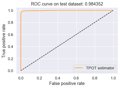
auc_test: 0.9865887972155001
Cross validation score on test dataset: 0.9533582089552238
type(X_test) <class 'numpy.ndarray'>
X_test.shape: (3799, 6)
Plot of the ROC curve
This is the best ROC curve I have been able to achieve on my dataset.
try:
    plt.figure()
    plt.plot([0, 1], [0, 1], 'k--')
    plt.plot(false_positive_rate, true_positive_rate,
             color='darkorange', label='TPOT estimator')
    plt.xlabel('False positive rate')
    plt.ylabel('True positive rate')

    print('type(X_test)', type(X_test))
    print('X_test.shape: ', X_test.shape)

    auc_test = roc_auc_score(y_test, y_predicted_test)
    plt.title('ROC curve on test dataset: %f' % auc_test)
    plt.legend(loc='best')
    plt.show()
    plt.close()
except:
    print("Cannot compute ROC curve: ", sys.exc_info()[0])
type(X_test) <class 'numpy.ndarray'>
X_test.shape:  (3799, 6)
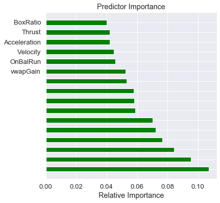
Plot of the feature importances
Notice that TPOT added features to the model, and our predictors are of lesser importance. Oh well, that’s feature engineering for you!
try:
    best_model = exported_pipeline._final_estimator
    feature_importances = best_model.feature_importances_
    importances = 100.0 * (feature_importances / feature_importances.max())
    sorted_idx = np.argsort(importances)
    y_pos = np.arange(sorted_idx.shape[0]) + .5
    fig, ax = plt.subplots()
    fig.set_size_inches(6.0, 6.0)
    ax.barh(y_pos,
            feature_importances[sorted_idx],
            align='center',
            color='green',
            ecolor='black',
            height=0.5)
    ax.set_yticks(y_pos)
    ax.set_yticklabels(feature_names)
    ax.invert_yaxis()
    ax.set_xlabel('Relative Importance')
    ax.set_title('Predictor Importance')
    plt.show()
except:
    print('Could not display the feature importances.')
plt.close()
# Cannot use shap on a TPOT pipeline

# import shap
# shap_values = shap.KernelExplainer(new_pipeline, X_train)
# shap.summary_plot(shap_values, X_train, plot_type="bar")
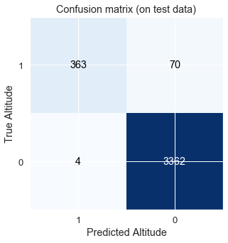
Plot of confusion matrices and print the correct classification on the test dataset
The class name “0” means that the profit goal was not met. Class “1” means the goal of at least 1.5% per day-trade was met.
Note that I use the Confusion Matrix as defined by Wikipedia: https://en.wikipedia.org/wiki/Confusion_matrix The matrix is: (True_Positive, False_Positive)/(False_Negative, True_Negative)
tn, fp, fn, tp = confusion_matrix(y_test, y_predicted_test).ravel()
print('true positive: ', tp, ', false positive: ', fp,
      ', false negative: ', fn, ', true negative: ', tn)

cm_test = np.array([[tp, fp], [fn, tn]])
print('\nTest Confusion matrix:\n', cm_test)

c_report = classification_report(y_test, y_predicted_test)
print('\nClassification report:\n', c_report)

ntotal = len(y_test)
correct = y_test == y_predicted_test
numCorrect = sum(correct)
percent = round((100.0*numCorrect)/ntotal, 6)
print("\nCorrect classifications on test data: {0:d}/{1:d} {2:8.3f}%".format(numCorrect,
                                                                             ntotal,
                                                                             percent))
prediction_score = 100.0*new_pipeline.score(X_test, y_test)
assert (round(percent, 3) == round(prediction_score, 3)), "prediction score does not agree"
true positive:  364 , false positive:  64 , false negative:  3 , true negative:  3368

Test Confusion matrix:
 [[ 364   64]
 [   3 3368]]

Classification report:
               precision    recall  f1-score   support

           0       1.00      0.98      0.99      3432
           1       0.85      0.99      0.92       367

    accuracy                           0.98      3799
   macro avg       0.92      0.99      0.95      3799
weighted avg       0.98      0.98      0.98      3799


Correct classifications on test data: 3732/3799   98.236%
plt.clf()
plt.figure(figsize=(5, 5), clear=True)
cmap = plt.cm.Blues
plt.imshow(cm_test, interpolation='nearest', cmap=cmap)
title = 'Confusion matrix (on test data)'
classes = [1, 0]
plt.title(title)
tick_marks = np.arange(len(classes))
plt.xticks(tick_marks, classes, rotation=0)
plt.yticks(tick_marks, classes)

thresh = cm_test.max() / 2.
for i, j in itertools.product(range(cm_test.shape[0]), range(cm_test.shape[1])):
    plt.text(j, i, cm_test[i, j],
             ha="center", va="center",
             color="white" if cm_test[i, j] > thresh else "black")

plt.ylabel('True Altitude')
plt.xlabel('Predicted Altitude')
plt.show()
<Figure size 432x288 with 0 Axes>
Print the model metrics
The following tables show the current results, and the previous best results.
true_positive_test = cm_test[0, 0]
false_positive_test = cm_test[0, 1]
false_negative_test = cm_test[1, 0]
true_negative_test = cm_test[1, 1]

total_test = true_positive_test + false_positive_test + \
    false_negative_test + true_negative_test

accuracy_test_ = (true_positive_test + true_negative_test)/total_test
precision_test_ = (true_positive_test) / \
    (true_positive_test + false_positive_test)
recall_test_ = (true_positive_test)/(true_positive_test + false_negative_test)
misclassification_rate_test = (
    false_positive_test + false_negative_test)/total_test
F1_test_ = (2*true_positive_test)/(2*true_positive_test +
                                   false_positive_test + false_negative_test)

y_predict_test = new_pipeline.predict(X_test)
mse_test = mean_squared_error(y_test, y_predict_test)
logloss_test = log_loss(y_test, y_predict_test)
accuracy_test = accuracy_score(y_test, y_predict_test)
precision_test = precision_score(y_test, y_predict_test)
recall_test = recall_score(y_test, y_predict_test)
F1_test = f1_score(y_test, y_predict_test)
r2_test = r2_score(y_test, y_predict_test)
auc_test = roc_auc_score(y_test, y_predict_test)

header = ["Metric", "Test dataset"]

table1 = [["Current metrics",        " "],
          ["accuracy",               accuracy_test],
          ["precision",              precision_test],
          ["recall",                 recall_test],
          ["misclassification rate", misclassification_rate_test],
          ["F1",                     F1_test],
          ["r2",                     r2_test],
          ["AUC",                    auc_test],
          ["mse",                    mse_test],
          ["logloss",                logloss_test]
         ]

table2 = [["Previous metrics",       " "],
          ['accuracy',               0.91943799],
          ['precision',              0.89705603],
          ['recall',                 0.94877461],
          ['misclassification rate', 0.08056201],
          ['F1',                     0.92219076],
          ['r2',                     0.67773888],
          ['AUC',                    0.91924997],
          ['mse',                    0.08056201],
          ['logloss',                2.78255718]
         ]

# Add parent directory so we can import ipy_table.
# Add it at the beginning of sys.path so that the local version is used rather than any installed version.
import os
import sys
module_path = os.path.abspath(os.path.join('..'))
if module_path not in sys.path:
    sys.path.insert(0, module_path)

from ipy_table import *

my_table1 = make_table(table1)
my_table1.apply_theme('basic')
my_table2 = make_table(table2)
my_table2.apply_theme('basic')

from IPython.core.display import HTML

def multi_table(table_list):
    return HTML(
        '<table cellspacing="20";><tr style="background-color:white;">' +
        ''.join(['<td>' + table._repr_html_() + '</td>' for table in table_list]) +
        '</tr></table>'
    )

# def multi_table(table_list):
#     return HTML(
#         '<table cellspacing="20";>' +
#           '<tr style="background-color:white;">' +
#           ''.join(['<td>' + table._repr_html_() + '</td>' for table in table_list]) +
#           '</tr>' +
#         '</table>'
#     )

multi_table([my_table1, my_table2])
|
|
Summary
This is the best performance so far, and it is now integrated into HedgeTools. The performance is due to TPOT. I would like to thank Dr. Randy Olsen and his team for their great work (http://www.randalolson.com/2015/11/15/introducing-tpot-the-data-science-assistant/).
The problem with this work is that it is implemented in Python 3. HedgeTools is an application that process a live telemetry feed in real time. The Python code that is used to make a prediction takes an average of 2655 milliseconds to execute. This is intolerable. Much to my dismay, the Python community is not doing anything about the execution time of Python.
As a result, we are now abandoning Python for our production code. The next post will show how we achieve a 10-fold speed improvement in prediction time by using C#. Stay tuned…