Visualize The Bottle Rocket Dataset
Visualization of the Bottle Rocket Dataset
This notebook is used to visualize the datasets. It does not do any model analysis. That will be done in the next notebook.
Charles Brauer
import itertools
import sys
import collections as count
from collections import Counter
import eli5
import lightgbm as lgb
import matplotlib
# import matplotlib.gridspec as gridspec
from matplotlib import gridspec, pyplot as plt
import numpy as np
from numpy import where
import os
import pandas as pd
import pickle
import platform
import seaborn
import seaborn as sns
import shap
import lime
import warnings
from eli5.sklearn import PermutationImportance
from lime.lime_tabular import LimeTabularExplainer
from pylab import rcParams
from scipy import stats
import sklearn
from sklearn.ensemble import ExtraTreesClassifier
from sklearn.model_selection import train_test_split
%matplotlib inline
shap.initjs()
sns.set(style='whitegrid', palette='muted', font_scale=1.1)

The development envirionment is:
print('Operating system version....', platform.platform())
print("Python version is........... %s.%s.%s" % sys.version_info[:3])
print('scikit-learn version is.....', sklearn.__version__)
print('pandas version is...........', pd.__version__)
print('numpy version is............', np.__version__)
print('seaborn version is..........', seaborn.__version__)
print('matplotlib version is.......', matplotlib.__version__)
print('shap version is.............', shap.__version__)
Operating system version.... Windows-10-10.0.18362-SP0
Python version is........... 3.7.6
scikit-learn version is..... 0.22.1
pandas version is........... 1.0.0
numpy version is............ 1.17.5
seaborn version is.......... 0.9.0
matplotlib version is....... 3.1.2
shap version is............. 0.34.0
choices = 'Choose: \n'\
' 1-rocket-train-classify.csv\n'\
' 2-rocket-test-classify.csv\n'\
' 3-rocket-train-classify-smote.csv\n'
path = ''
response = input(choices)
if response == '1':
path = "rocket-train-classify.csv"
if response == '2':
# print('2 was chosen')
path = "rocket-test-classify.csv"
if response == '3':
# print('2 was chosen')
path = "rocket-train-classify-smote.csv"
if os.path.isfile(path):
print('found o.k.')
else:
print('File not found.')
Choose:
1-rocket-train-classify.csv
2-rocket-test-classify.csv
3-rocket-train-classify-smote.csv
3
found o.k.
Choose which dataset to visualize
np.random.seed(1)
try:
file_path = "H:/HedgeTools/Datasets/" + path
df_orig = pd.read_csv(file_path)
except FileNotFoundError:
print('file not found. The path is: ', file_path)
# raise SystemExit("Stop right there!")
raise ValueError("Re-run the notebook")
response_name = ['Altitude']
feature_names = ['BoxRatio', 'Thrust', 'Acceleration', 'Velocity', 'OnBalRun', 'vwapGain']
mask = feature_names + response_name
df = df_orig[mask]
print('df:\n', df.head(5))
pd.set_option('display.expand_frame_repr', False)
print('\nDescription of df dataset:\n', df[feature_names].describe(include='all'))
X = df[feature_names].values
y = df[response_name].values.ravel()
X_train, X_test, y_train, y_test = train_test_split(X, y, test_size=0.3)
print('Shape of datasets:')
print(' train shape... ', X_train.shape, y_train.shape)
print(' test shape.... ', X_test.shape, y_test.shape)
df:
BoxRatio Thrust Acceleration Velocity OnBalRun vwapGain Altitude
0 0.6687 0.0911 0.7501 -1.0402 -0.0232 -0.9291 0
1 0.1783 -0.4922 1.6609 -1.4106 0.7144 -0.4505 0
2 -0.9364 -0.9592 0.7717 -0.3861 0.8325 -0.2575 0
3 -0.3736 -1.6256 0.4161 -0.4394 0.6550 -0.4435 1
4 0.7936 -1.1712 2.0178 0.3764 0.5175 1.1961 0
Description of df dataset:
BoxRatio Thrust Acceleration Velocity OnBalRun vwapGain
count 14014.000000 14014.000000 14014.000000 14014.000000 14014.000000 14014.000000
mean 0.134619 -0.441927 1.252422 -0.664625 0.796830 -0.002468
std 1.241720 1.351282 0.676917 0.799240 0.480922 0.695959
min -4.073700 -6.812400 0.010000 -2.995700 -0.140200 -0.935700
25% -0.592554 -1.239498 0.834425 -1.183125 0.428100 -0.506300
50% -0.015300 -0.423390 1.146067 -0.672800 0.753745 -0.166895
75% 0.778750 0.430400 1.548154 -0.188444 1.124351 0.306100
max 6.266700 4.540600 6.205300 3.122400 2.982100 3.596400
Shape of datasets:
train shape... (9809, 6) (9809,)
test shape.... (4205, 6) (4205,)
Check for the null values
As you can see, there are no missing values in the dataset
print("Are there missing values in the dataset?")
df.isna().sum()
Are there missing values in the dataset?
BoxRatio 0
Thrust 0
Acceleration 0
Velocity 0
OnBalRun 0
vwapGain 0
Altitude 0
dtype: int64
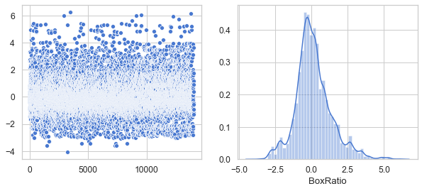
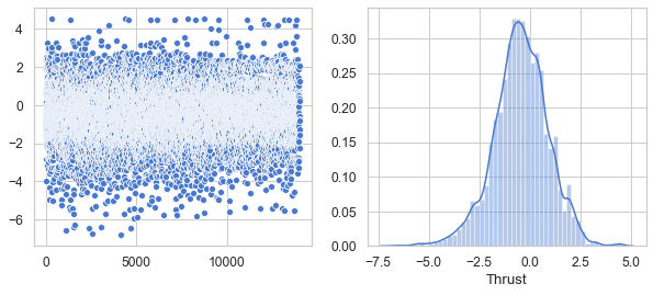
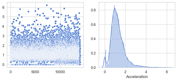
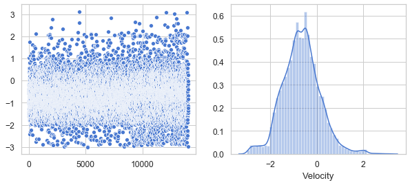
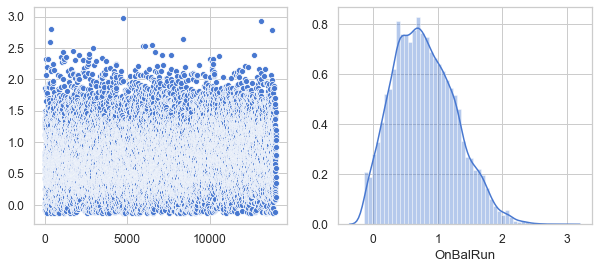
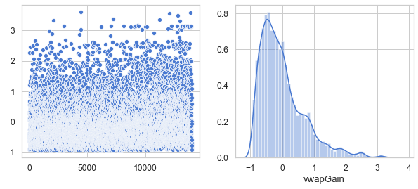
Show that all six features have a Gaussian distribution
warnings.filterwarnings('ignore')
plt.figure(figsize=(10, 4))
df_br = df[['BoxRatio']]
v = df_br.BoxRatio.values
plt.subplot(1, 2, 1)
sns.scatterplot(data=v)
plt.subplot(1, 2, 2)
sns.distplot(v, axlabel='BoxRatio')
df1 = pd.DataFrame(data=v, columns=['BoxRatio'])
plt.show()
plt.figure(figsize=(10, 4))
df_th = df[['Thrust']]
v = df_th.Thrust.values
plt.subplot(1, 2, 1)
sns.scatterplot(data=v)
plt.subplot(1, 2, 2)
sns.distplot(v, axlabel='Thrust')
df2 = pd.DataFrame(data=v, columns=['Thrust'])
df3 = pd.concat([df1, df2], axis=1).reindex(df1.index)
plt.show()
plt.figure(figsize=(10,4))
df_ac = df[['Acceleration']]
v = df_ac.Acceleration.values
plt.subplot(1, 2, 1)
sns.scatterplot(data=v)
plt.subplot(1, 2, 2)
sns.distplot(v, axlabel='Acceleration')
df4 = pd.DataFrame(data=v, columns=['Acceleration'])
df5 = pd.concat([df3, df4], axis=1).reindex(df1.index)
plt.show()
plt.figure(figsize=(10, 4))
df_ve = df[['Velocity']]
v = df_ve.Velocity.values
plt.subplot(1, 2, 1)
sns.scatterplot(data=v)
plt.subplot(1, 2, 2)
sns.distplot(v, axlabel='Velocity')
df6 = pd.DataFrame(data=v, columns=['Velocity'])
df7 = pd.concat([df5, df6], axis=1).reindex(df1.index)
plt.show()
plt.figure(figsize=(10, 4))
df_on = df[['OnBalRun']]
v = df_on.OnBalRun.values
plt.subplot(1, 2, 1)
sns.scatterplot(data=v)
plt.subplot(1, 2, 2)
sns.distplot(v, axlabel='OnBalRun')
df8 = pd.DataFrame(data=v, columns=['OnBalRun'])
df9 = pd.concat([df7, df8], axis=1).reindex(df1.index)
plt.show()
plt.figure(figsize=(10, 4))
df_vw = df[['vwapGain']]
v = df_vw.vwapGain.values
plt.subplot(1, 2, 1)
sns.scatterplot(data=v)
plt.subplot(1, 2, 2)
sns.distplot(v, axlabel='vwapGain')
df10 = pd.DataFrame(data=v, columns=['vwapGain'])
df11 = pd.concat([df9, df10], axis=1).reindex(df1.index)
plt.show()
plt.tight_layout()
df12 = df_orig[['Altitude']]
df_scaled = pd.concat([df11, df12], axis=1).reindex(df1.index)
#print('df_scaled:\n', df_scaled.head(5))
#pd.set_option('display.expand_frame_repr', False)
#print('\nDescription of df_scaled dataset:\n', df_scaled[feature_names].describe(include='all'))
<Figure size 432x288 with 0 Axes>
Split the dataset into train/test
X = df_scaled[feature_names].values
y = df_scaled[response_name].values.ravel()
X_train, X_test, y_train, y_test = train_test_split(X, y, test_size=0.3)
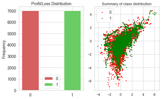
Show the distribution of the data
count = pd.value_counts(df['Altitude'], sort=True)
print('\ngoal failed: ', count[0], ' goal met: ', count[1])
rcParams['figure.figsize'] = 5, 5
datas = [{'label': '0', 'color': 'r', 'height': count[0]},
{'label': '1', 'color': 'g', 'height': count[1]}]
plt.figure(figsize=(8, 5))
plt.subplot(121)
i = 0
for data in datas:
plt.bar(i, data['height'], align='center', color=data['color'], width=0.4)
i += 1
labels = [data['label'] for data in datas]
pos = [i for i in range(len(datas))]
font_size = 14
plt.xticks(pos, labels, size=font_size)
plt.yticks(size=font_size)
plt.ylabel('Frequency', size=font_size)
plt.title('Profit/Loss Distribution', size=font_size)
plt.rc('legend', **{'fontsize': font_size})
plt.legend(labels)
plt.subplot(122)
counter = Counter(y)
for label, _ in counter.items():
row_ix = where(y == label)[0]
if label == 0:
c = 'red'
else:
c = 'green'
plt.scatter(X[row_ix, 0], X[row_ix, 1], label=str(label), color=c, s=5)
plt.legend()
plt.title('Summary of class distribution')
plt.tight_layout()
plt.show()
goal failed: 7007 goal met: 7007
Identify Highly Correlated Features
Thanks to Chris Albon (https://chrisalbon.com/machine_learning/feature_selection/drop_highly_correlated_features/ for this code.
The Pearson coefficient is a statistical measure of the degree to which changes to the value of one variable predict change to the value of another. Since, in out case, the coefficients are all postive, this means that the value increases or decreases in tandem
Since this is well below the 0.95 threshold, we can keep all the features.
# Create correlation matrix
corr_matrix = df_scaled.corr().abs()
d = df_scaled.drop(['Altitude'], axis=1)
df_corr = pd.DataFrame([[(i, j), d.corr().loc[i, j]]
for i, j in list(itertools.combinations(d.corr(), 2))],
columns=['pairs', 'corr'])
print(df_corr.sort_values(by='corr', ascending=False))
# Select upper triangle of correlation matrix
upper = corr_matrix.where(
np.triu(np.ones(corr_matrix.shape), k=1).astype(np.bool))
# Find index of feature columns with correlation greater than 0.95
to_drop = [column for column in upper.columns if any(upper[column] > 0.95)]
if not to_drop:
print('Features to drop: None.\n')
else:
print('Features to drop: \n', to_drop)
pairs corr
13 (Velocity, vwapGain) 0.739043
0 (BoxRatio, Thrust) 0.609785
11 (Acceleration, vwapGain) 0.523206
14 (OnBalRun, vwapGain) 0.471136
10 (Acceleration, OnBalRun) 0.465360
12 (Velocity, OnBalRun) 0.440961
9 (Acceleration, Velocity) 0.403183
4 (BoxRatio, vwapGain) 0.386043
2 (BoxRatio, Velocity) 0.288561
8 (Thrust, vwapGain) 0.274572
1 (BoxRatio, Acceleration) 0.265233
6 (Thrust, Velocity) 0.216654
7 (Thrust, OnBalRun) 0.206111
5 (Thrust, Acceleration) 0.201109
3 (BoxRatio, OnBalRun) 0.184059
Features to drop: None.
Show Pearson’s correlation between features in the first fourteen pairs
warnings.filterwarnings('ignore')
warnings.simplefilter('ignore')
sns.set(font_scale=1.2)
class SeabornFig2Grid():
def __init__(self, seaborngrid, fig, subplot_spec):
self.fig = fig
self.sg = seaborngrid
self.subplot = subplot_spec
if isinstance(self.sg, sns.axisgrid.FacetGrid) or \
isinstance(self.sg, sns.axisgrid.PairGrid):
self._movegrid()
elif isinstance(self.sg, sns.axisgrid.JointGrid):
self._movejointgrid()
self._finalize()
def _movegrid(self):
""" Move PairGrid or Facetgrid """
self._resize()
n = self.sg.axes.shape[0]
m = self.sg.axes.shape[1]
self.subgrid = gridspec.GridSpecFromSubplotSpec(
n, m, subplot_spec=self.subplot)
for i in range(n):
for j in range(m):
self._moveaxes(self.sg.axes[i, j], self.subgrid[i, j])
def _movejointgrid(self):
""" Move Jointgrid """
h = self.sg.ax_joint.get_position().height
h2 = self.sg.ax_marg_x.get_position().height
r = int(np.round(h/h2))
self._resize()
self.subgrid = gridspec.GridSpecFromSubplotSpec(
r+1, r+1, subplot_spec=self.subplot)
self._moveaxes(self.sg.ax_joint, self.subgrid[1:, :-1])
self._moveaxes(self.sg.ax_marg_x, self.subgrid[0, :-1])
self._moveaxes(self.sg.ax_marg_y, self.subgrid[1:, -1])
def _moveaxes(self, ax, gs):
ax.remove()
ax.figure = self.fig
self.fig.axes.append(ax)
self.fig.add_axes(ax)
ax._subplotspec = gs
ax.set_position(gs.get_position(self.fig))
ax.set_subplotspec(gs)
def _finalize(self):
plt.close(self.sg.fig)
self.fig.canvas.mpl_connect("resize_event", self._resize)
self.fig.canvas.draw()
def _resize(self, evt=None):
self.sg.fig.set_size_inches(self.fig.get_size_inches())
g0 = sns.jointplot("Acceleration", "Velocity",
data=df,
fit_reg=True,
kind='reg',
height=7,
ratio=3,
color="b",
scatter_kws={"s": 5})
g0.annotate(stats.pearsonr)
g1 = sns.jointplot("OnBalRun", "vwapGain",
data=df,
fit_reg=True,
kind='reg',
height=7,
ratio=3,
color="b",
scatter_kws={"s": 5})
g1.annotate(stats.pearsonr)
g2 = sns.jointplot("BoxRatio", "Thrust",
data=df,
fit_reg=True,
kind='reg',
height=7,
ratio=3,
color="b",
scatter_kws={"s": 5})
g2.annotate(stats.pearsonr)
g3 = sns.jointplot("Acceleration", "OnBalRun",
data=df,
fit_reg=True,
kind='reg',
height=7,
ratio=3,
color="b",
scatter_kws={"s": 5})
g3.annotate(stats.pearsonr)
g4 = sns.jointplot("Velocity", "vwapGain",
data=df,
fit_reg=True,
kind='reg',
height=7,
ratio=3,
color="b",
scatter_kws={"s": 5})
g4.annotate(stats.pearsonr)
g5 = sns.jointplot("Acceleration", "vwapGain",
data=df,
fit_reg=True,
kind='reg',
height=7,
ratio=3,
color="b",
scatter_kws={"s": 5})
g5.annotate(stats.pearsonr)
g6 = sns.jointplot("Velocity", "OnBalRun",
data=df,
fit_reg=True,
kind='reg',
height=7,
ratio=3,
color="b",
scatter_kws={"s": 5})
g6.annotate(stats.pearsonr)
g7 = sns.jointplot("BoxRatio", "vwapGain",
data=df,
fit_reg=True,
kind='reg',
height=7,
ratio=3,
color="b",
scatter_kws={"s": 5})
g7.annotate(stats.pearsonr)
g8 = sns.jointplot("BoxRatio", "Velocity",
data=df,
fit_reg=True,
kind='reg',
height=7,
ratio=3,
color="b",
scatter_kws={"s": 5})
g8.annotate(stats.pearsonr)
g9 = sns.jointplot("Thrust", "vwapGain",
data=df,
fit_reg=True,
kind='reg',
height=7,
ratio=3,
color="b",
scatter_kws={"s": 5})
g9.annotate(stats.pearsonr)
g10 = sns.jointplot("BoxRatio", "Acceleration",
data=df,
fit_reg=True,
kind='reg',
height=7,
ratio=3,
color="b",
scatter_kws={"s": 5})
g10.annotate(stats.pearsonr)
g11 = sns.jointplot("BoxRatio", "OnBalRun",
data=df,
fit_reg=True,
kind='reg',
height=7,
ratio=3,
color="b",
scatter_kws={"s": 5})
g11.annotate(stats.pearsonr)
g12 = sns.jointplot("Thrust", "OnBalRun",
data=df,
fit_reg=True,
kind='reg',
height=7,
ratio=3,
color="b",
scatter_kws={"s": 5})
g12.annotate(stats.pearsonr)
g13 = sns.jointplot("Thrust", "Acceleration",
data=df,
fit_reg=True,
kind='reg',
height=7,
ratio=3,
color="b",
scatter_kws={"s": 5})
g13.annotate(stats.pearsonr)
fig = plt.figure(figsize=(11, 20))
gs = gridspec.GridSpec(7, 2)
mg0 = SeabornFig2Grid(g0, fig, gs[0])
mg1 = SeabornFig2Grid(g1, fig, gs[1])
mg2 = SeabornFig2Grid(g2, fig, gs[2])
mg3 = SeabornFig2Grid(g3, fig, gs[3])
mg4 = SeabornFig2Grid(g4, fig, gs[4])
mg5 = SeabornFig2Grid(g5, fig, gs[5])
mg6 = SeabornFig2Grid(g6, fig, gs[6])
mg7 = SeabornFig2Grid(g7, fig, gs[7])
mg8 = SeabornFig2Grid(g8, fig, gs[8])
mg9 = SeabornFig2Grid(g9, fig, gs[9])
mg10 = SeabornFig2Grid(g10, fig, gs[10])
mg11 = SeabornFig2Grid(g11, fig, gs[11])
mg12 = SeabornFig2Grid(g12, fig, gs[12])
mg13 = SeabornFig2Grid(g13, fig, gs[13])
gs.tight_layout(fig)
plt.show()
Use a Light GBM model for the visualization
d_train = lgb.Dataset(X_train, label=y_train, feature_name=feature_names)
d_test = lgb.Dataset(X_test, label=y_test, feature_name=feature_names)
params = {
"max_bin": 512,
"learning_rate": 0.05,
"boosting_type": "gbdt",
"objective": "binary",
"metric": "binary_logloss",
"num_leaves": 10,
"verbose": -1,
"min_data": 100,
"boost_from_average": True
}
model = lgb.train(params,
d_train,
10000,
valid_sets=[d_test],
early_stopping_rounds=50,
verbose_eval=1000)
Training until validation scores don't improve for 50 rounds
[1000] valid_0's binary_logloss: 0.457265
[2000] valid_0's binary_logloss: 0.416592
[3000] valid_0's binary_logloss: 0.393908
[4000] valid_0's binary_logloss: 0.381266
Early stopping, best iteration is:
[4365] valid_0's binary_logloss: 0.379449
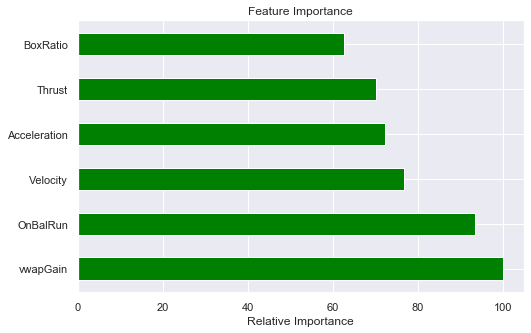
Compute the feature importances
feature_importances = model.feature_importance()
std = np.std([tree.feature_importances_ for tree in forest.estimators_], axis=0)
indices = np.argsort(feature_importances)[::-1]
# Print the feature ranking
print("Feature ranking:")
for k in range(X_train.shape[1]):
j = indices[k]
print("%d: %s (%f)" % (k + 1, feature_names[j], feature_importances[j]))
feature_importance = 100.0 * (feature_importances / feature_importances.max())
sorted_idx = np.argsort(feature_importance)
y_pos = np.arange(sorted_idx.shape[0]) + .5
fig, ax = plt.subplots()
fig.set_size_inches(8, 5)
ax.barh(y_pos,
feature_importance[sorted_idx],
align='center',
color='green',
ecolor='black',
height=0.5)
ax.set_yticks(y_pos)
ax.set_yticklabels(feature_names)
ax.invert_yaxis()
ax.set_xlabel('Relative Importance')
ax.set_title('Feature Importance')
plt.show()
Feature ranking:
1: Thrust (8266.000000)
2: BoxRatio (7725.000000)
3: Velocity (6342.000000)
4: vwapGain (5971.000000)
5: OnBalRun (5800.000000)
6: Acceleration (5181.000000)
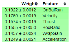
Permutation Importance
As a second opinion, we can also use Permutation Importance to show us what features are most important. This routine will shuffle the data and remove different input variables to see what relative change results in the calculatioin of the training model. It measures how much the outcome goes up or down given the input variable, thus calculating their impact on the results.
perm = PermutationImportance(forest, n_iter=2).fit(X_train, y_train)
eli5.show_weights(perm, feature_names=feature_names)
Compute the first five feature contributions using Lime.
explainer = LimeTabularExplainer(X_train, mode="classification", feature_names=feature_names)
for index in range(5):
X_observation = X_train[index, :]
print('X_observation:', X_observation)
explanation = explainer.explain_instance(X_observation, forest.predict_proba)
explanation.show_in_notebook(show_table=False, show_all=True)
print(explanation.score)
X_observation: [-1.7771 1.0094 3.14913515 0.4322175 1.7431 1.28306144]
0.19142100229887227
X_observation: [ 0.1147 -1.207 1.656 -0.5811 1.3011 0.2247]
0.12747816074385254
X_observation: [-0.6329 -0.0552 0.9232 -1.2701 0.3618 -0.3227]
0.18105144678892426
X_observation: [ 0.1956 -0.9734 0.4776 -1.2235 0.0746 -0.6114]
0.13655918519226573
X_observation: [-1.3000e-03 -2.5459e+00 1.1524e+00 -8.9360e-01 4.1170e-01 -7.2260e-01]
0.0980715967289203
SHAP explanations of model predictions of the Bottle Rocket dataset.
SHAP values represent a feature’s responsibility for a change in the model output.
I would like to give credit to Scott Lundberg for the following code. His work can be found at https://github.com/slundberg/shap
explainer = shap.TreeExplainer(forest)
df_shap = pd.DataFrame(data=X, columns=feature_names)
shap_values = explainer.shap_values(df_shap)
explainer_save = explainer
shap_values_save = shap_values
import pickle
pickle.dump(explainer, open("explainer.pkl", "wb"))
pickle.dump(shap_values, open("shap_values.pkl", "wb"))
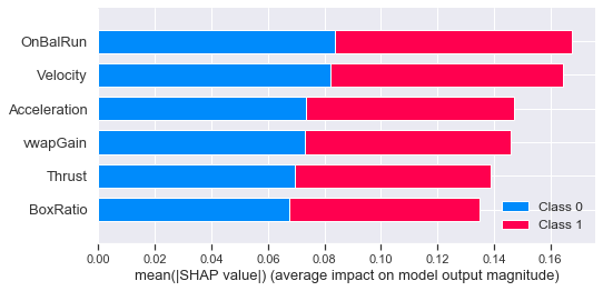
SHAP Summary Plot
Rather than use a typical feature importance bar chart, we use a density scatter plot of SHAP values for each feature to identify how much impact each feature has on the model output, using the test dataset. Features are sorted by the sum of the SHAP value magnitudes across all samples.
Note that when the scatter points don’t fit on a line they pile up to show density, and the color of each point represents the feature value of that individual.
explainer = pickle.load(open("explainer.pkl", "rb"))
shap_values = pickle.load(open("shap_values.pkl", "rb"))
df_shap = pd.DataFrame(data=X_test, columns=feature_names)
shap.summary_plot(shap_values, df_shap, plot_type="bar")
Using SHAP to explain a model’s prediction
Here we use Light GBM to obtain a model that we can explain using SHAP.
Visualize a single prediction
Here we use SHAP to explain a prediction using only the first row of the Bottle Rocket dataset.
explainer2 = shap.TreeExplainer(model)
X2 = df_orig[feature_names]
shap_values2 = explainer2.shap_values(X2)
shap.force_plot(explainer2.expected_value[1], shap_values2[1][0,:], X2.iloc[1])
Setting feature_perturbation = "tree_path_dependent" because no background data was given.
LightGBM binary classifier with TreeExplainer shap values output has changed to a list of ndarray
Have you run `initjs()` in this notebook? If this notebook was from another user you must also trust this notebook (File -> Trust notebook). If you are viewing this notebook on github the Javascript has been stripped for security. If you are using JupyterLab this error is because a JupyterLab extension has not yet been written.
Using the first two rows of the dataset.
shap.force_plot(explainer2.expected_value[1], shap_values2[1][:2,:], X2.iloc[:2,:])
Have you run `initjs()` in this notebook? If this notebook was from another user you must also trust this notebook (File -> Trust notebook). If you are viewing this notebook on github the Javascript has been stripped for security. If you are using JupyterLab this error is because a JupyterLab extension has not yet been written.
Visualize many predictions
Here we visualize the first 100 rows of the Bottle Rocket dataset.
shap.force_plot(explainer2.expected_value[1], shap_values2[1][:100,:], X2.iloc[:100,:])
Have you run `initjs()` in this notebook? If this notebook was from another user you must also trust this notebook (File -> Trust notebook). If you are viewing this notebook on github the Javascript has been stripped for security. If you are using JupyterLab this error is because a JupyterLab extension has not yet been written.
Summary
This notebook shows that:
- We should use all the features in our model.
- The features pass a correlation test.
- There are no missing values in the dataset.
- There are no category features in the dataset.
- The features have been pre-scaled and the feature distributions are Gaussian.
- All six features contribute significantly to the model prediction.
In the nest notebook, we go into model creation using ML.NET.